Solved Examples and Worksheet for Reading and Interpreting Scatter plots
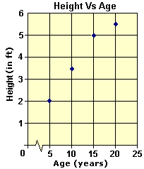
A. 4 ft
B. 5.6 ft
C. 3.5 ft
D. 5 ft
Step: 1
The vertical coordinate of each point in the scatterplot represents Andrew's height and the horizontal coordinate represents his age.
Step: 2
From the graph, the vertical coordinate of the point corresponding to 15 years is 5 ft.
Step: 3
So, Andrew was 5 ft tall when he was 15 years old.
Correct Answer is : 5 ft
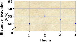
A. 157.5 km
B. 55 km
C. 52.5 km
D. 160 km
Step: 1
The vertical coordinate of each point on the scatter plot indicates the distance traveled by Diane during each hour.
Step: 2
The distance traveled in the first hour of the journey is 50 km.
Step: 3
The distance traveled in the second hour is 55 km.
Step: 4
The distance covered in third hour is 52.5 km. as it is in between 50 and 55.
Step: 5
The total distance covered in the first three hours of the journey = 50 + 55 + 52.5 = 157.5 km.
[Add.]
Step: 6
The distance traveled by Diane in 3 hours is 157.5 km.
Correct Answer is : 157.5 km
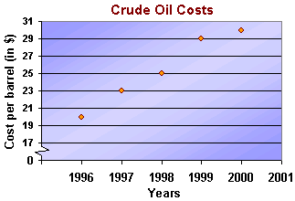
A. $30
B. $23
C. $25
D. $29
Step: 1
In the scatterplot, the horizontal axis represents the year and the vertical axis represents the cost per barrel (in $).
Step: 2
The height of each point on the scatterplot represents the cost per barrel (in $) of crude oil in the corresponding year.
Step: 3
From the graph, the vertical coordinate of the point corresponding to the year 1998 is 25.
Step: 4
So, the cost of crude oil per barrel in 1998 was $25.
Correct Answer is : $25
A. 1997
B. 1996
C. 1998
D. 2000
Step: 1
In the scatter plot, the horizontal axis represents the year and the vertical axis represents the cost per barrel (in $).
Step: 2
From the graph, the minimum cost of crude oil per barrel is $20.
Step: 3
From the graph, the horizontal coordinate corresponding to $20 is 1996.
Step: 4
So, the cost of crude oil per barrel is minimum in the year 1996.
Correct Answer is : 1996
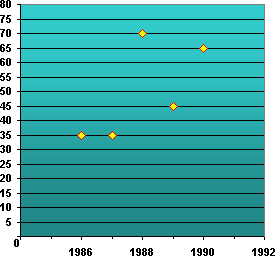
A. 195
B. 150
C. 215
D. 172
Step: 1
Number of matches won in 1987 = 35
Step: 2
Number of matches won in 1988 = 70
Step: 3
Number of matches won in 1989 = 45
Step: 4
Number of matches won in 1990 = 65
Step: 5
Total number of matches won by the USA from 1987 to 1990 = 35 + 70 + 45 + 65 = 215
Step: 6
So, the total number of matches won by the USA from 1987 to 1990 = 215.
Correct Answer is : 215
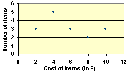
A. $50
B. $90
C. $80
D. $100
Step: 1
The height of each point on the scatter plot indicates the number of items of a particular cost bought by Lindsay.
Step: 2
From the graph, the number of items of costs $2, $4, $6, $8 and $10 are 3, 5, 3, 2 and 3 respectively.
Step: 3
The total amount spent by her is the sum of the products of the number of items and the cost of each item.
Step: 4
So, the total amount = $2 x 3 + $4 x 5 + $6 x 3 + $8 x 2 + $10 x 3
= 6 + 20 + 18 + 16 + 30 = $90
[Multiply number of items and cost of each item and add all.]
Step: 5
So, Lindsay spent $90 in the supermarket.
Correct Answer is : $90
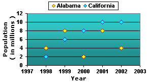
A. Alabama
B. California
Step: 1
The height of each point in the plot represents the population of a particular state in a particular year.
Step: 2
From the plot, the population of Alabama in the year 2000 is 2 million.
Step: 3
The population of California in the year 2000 is 8 million.
Step: 4
So, the population of California is higher than the population of Alabama in the year 2000.
[8 million is greater than 2 million.]
Correct Answer is : California
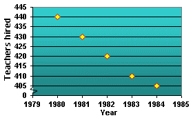
A. 20
B. 15
C. 5
D. 10
Step: 1
The height of each point in the scatter plot represents the number of teachers hired that year.
Step: 2
Number of teachers hired in the year 1983 = 410
Step: 3
Number of teachers hired in the year 1984 = 405
Step: 4
The difference between the number of teachers hired in 1983 and in 1984 = number of teachers hired in 1983 - number of teachers hired in 1984
= 410 - 405 = 5
[Substitute the values and simplify.]
Step: 5
So, 5 more teachers were hired in 1983 than the number of teachers hired in 1984.
Correct Answer is : 5
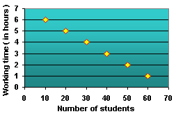
A. 40
B. 50
C. 20
D. 30
Step: 1
The height of each point in the scatter plot represents the number of working hours and the number of students working.
Step: 2
From the graph, the height of the point representing those who work 4 hours a day corresponds to the working hours of 30 students.
Step: 3
So, the number of students who work for 4 hours everyday is 30.
Correct Answer is : 30
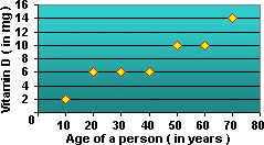
A. 14
B. 6
C. 2
D. 10
Step: 1
The height of each point in the scatter plot represents the number of milligrams required at that particular age.
Step: 2
From the scatter plot, the height of the point corresponding to the age of the person when he or she is 50 is 10 mg.
Step: 3
So, 10 milligrams of vitamin D is required for a 50 year old person.
Correct Answer is : 10
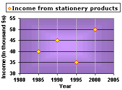
A. 2000
B. 1990
C. 1995
D. 1985
Step: 1
The height of each point in the graph indicates the income (in $1000) of the dealer in the particular year.
Step: 2
From the graph, the incomes of the dealer in 1985, 1990, 1995 and 2000 are $40000, $45000, $35000 and $50000, respectively.
Step: 3
The income of the dealer was the highest in 2000.
Correct Answer is : 2000
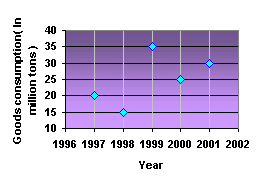
A. 25
B. 10
C. 35
D. 30
Step: 1
From the plot the consumption of the goods in 1999 was 35 million tons.
Step: 2
The consumption of the goods in the year 2000 is 25 million tons.
Step: 3
So, the decrease in the consumption of goods is 35 - 25 = 10 million tons.
Correct Answer is : 10
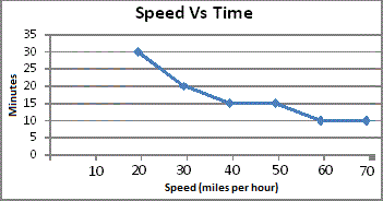
A. 8 minutes
B. 7 minutes
C. 5 minutes
D. 4 minutes
Step: 1
Each point in the scatter plot represents the time taken to travel from City A to City B, at various speeds.
Step: 2
From the graph, the time taken by Annie at a speed of 40 miles per hour is 15 minutes.
Step: 3
The time taken by her at a speed of 60 miles per hour is 10 minutes.
Step: 4
Difference between the times = 15 - 10 = 5 minutes
Step: 5
So, Annie can save 5 minutes by traveling at a speed of 60 miles per hour than at a speed of 40 miles per hour.
Correct Answer is : 5 minutes
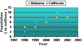
A. 200%
B. 100%
C. 50%
D. 150%
Step: 1
The height of each point in the plot represents the population of a particular state in a particular year.
Step: 2
From the plot, the population of Alabama in the year 1999 is 4 million.
Step: 3
The population of Alabama in the year 2002 is 8 million.
Step: 4
Increase in the population = 8 - 4 = 4 million
[Subtract 4 from 8.]
Step: 5
So, the percentage increase in the population = Increase Original
= 4 4
[Divide.]
Correct Answer is : 100%
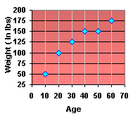
A. 100
B. 125
C. 50
D. 175
Step: 1
In the scatter plot, the horizontal axis represents Charles's age and the vertical axis represents his weight in lb.
Step: 2
The vertical distance of each point in the scatter plot indicates the weight of Charles when he was a particular age.
Step: 3
From the graph, the vertical distance of the point corresponding to 30 is 125.
Step: 4
So, the weight of Charles was 125 lb when he was 30 years old.
Correct Answer is : 125
- Writing Quadratic Equations for Line of Fit-Algebra1-Solved Examples
- Constructing Line Plots-Algebra1-Solved Examples
- Constructing Histograms-Algebra1-Solved Examples
- Constructing Box-and-Whisker Plots-Algebra1-Solved Examples
- Constructing Scatter Plots and Line of Fit-Algebra1-Solved Examples
- Comparing Two Related Sets of Data and Expected Value-Algebra1-Solved Examples
- Identifying Outliers-Algebra1-Solved Examples
- Comparing Linear, Quadratic and Exponential Models-Algebra1-Solved Examples
- Correlation Coefficient, Causation and Correlation-Algebra1-Solved Examples
- Meaning of Slope and Intercepts in Graphs and Situations-Algebra1-Solved Examples
Related Worksheet
- Scatter Plot