Solved Examples and Worksheet for Constructing Histograms
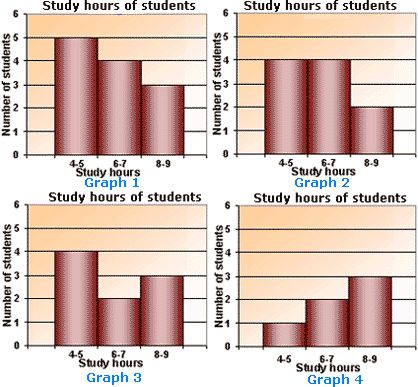
A. Graph 3
B. Graph 4
C. Graph 2
D. Graph 1
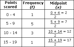
Step: 1
The bars in the histogram indicate the number of students who study for the particular number of hours.
Step: 2
From the data, the number of students who study for 4 to 5 hours is 4.
[There are 4 numbers in the range of 4 to 5.]
Step: 3
The number of students who study for 6 to 7 hours is 4.
[There are 4 numbers in the range of 6 to 7.]
Step: 4
The number of students who study for 8 to 9 hours is 2.
[There are 2 numbers in the range 8 to 9.]
Step: 5
The histogram in Graph 2 has bars of heights 4, 4 and 2.
Step: 6
So, the histogram shown in Graph 2 represents the data correctly.
Correct Answer is : Graph 2
| Number of sales | Frequency |
| 11 - 15 | 5 |
| 16 - 20 | 7 |
| 21 - 25 | 17 |
| 26 - 30 | 10 |
| 31 - 35 | 3 |
| 36 - 40 | 8 |
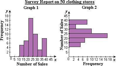
A. Graph 1 only
B. both Graph 1 and Graph 2
C. Graph 2 only
D. neither Graph 1 nor Graph 2
Step: 1
Class boundaries of each class (number of sales) are shown in the frequency distribution.
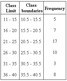
Step: 2
Represent the frequency on the y x
Step: 3
Step: 4
So, Graph 1 represents the histogram for the data.
Correct Answer is : Graph 1 only
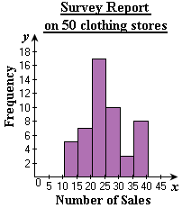
| Hours | Number of vehicles (in thousands) |
| 0 - 6 | 1.5 |
| 7 - 12 | 2.5 |
| 13 - 18 | 1.5 |
| 19 - 24 | 1 |
A. Graph 3
B. Graph 4
C. Graph 2
D. Graph 1
Step: 1
The heights of the bars in the histograms indicate the number of vehicles that go in the route in a particular interval of time in a day.
Step: 2
Observe the heights of the bars in the histograms to match with the values given in the table.
Step: 3
It can be observed that the heights of the bars in histogram of Graph 4 exactly match with the data in the table.
Step: 4
So, the histogram in Graph 4 represents the data given in the table correctly.
Correct Answer is : Graph 4
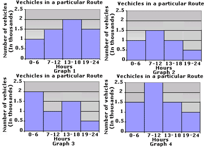
| Amount (in $) | Discount% |
| 1000 - 1999 | 1 |
| 2000 - 2999 | 2 |
| 3000 - 3999 | 4 |
| 4000 - 4999 | 8 |
| 5000 - 5999 | 10 |
A. Graph 4
B. Graph 3
C. Graph 2
D. Graph 1
Step: 1
The heights of the bars in the histogram indicate the discount offered (in %) for the corresponding amount (in $).
Step: 2
Match the heights of the bars in each graph with the values in the table.
Step: 3
It can be observed that the heights of the bars in Graph 3 match with the values in the table.
Step: 4
So, Graph 3 is the correct representation of the data.
Correct Answer is : Graph 3
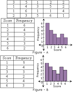
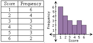
| Points scored | Frequency ( |
| 0 - 4 | 1 |
| 5 - 9 | 5 |
| 10 - 14 | 3 |
| 15 - 19 | 1 |
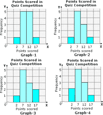
A. Graph - 1
B. Graph - 3
C. Graph - 2
D. Graph - 4
Step: 1
First, find the midpoint of each class using the formula,
Midpoint of a class,x l o w e r l i m i t + u p p e r l i m i t 2
Midpoint of a class,
[Formula.]
Step: 2
From the table, the points scored is represented along the horizontal axis and the respective frequency along the vertical axis. The height of each rectangle represents the frequency of the corresponding class.
Step: 3
Observe the histograms to match the plotted points with the values given in the table.
Step: 4
Among the graphs, Graph 2 is the correct representation of the table.
Correct Answer is : Graph - 2
A. Graph 1
B. Graph 3
C. Graph 2
D. Graph 4
Step: 1
The bars in the histogram indicate the number of students who study for the particular number of hours.
Step: 2
From the data, the number of students who study for 4 to 5 hours is 4.
[There are 4 numbers in the range of 4 to 5.]
Step: 3
The number of students who study for 6 to 7 hours is 4.
[There are 4 numbers in the range of 6 to 7.]
Step: 4
The number of students who study for 8 to 9 hours is 2.
[There are 2 numbers in the range 8 to 9.]
Step: 5
The histogram in Graph 2 has bars of heights 4, 4 and 2.
Step: 6
So, the histogram shown in Graph 2 represents the data correctly.
Correct Answer is : Graph 2
| Class-interval | Frequency |
| 5 - 10 | 2 |
| 10 - 15 | 2.5 |
| 15- 20 | 1.5 |
| 20- 25 | 1 |
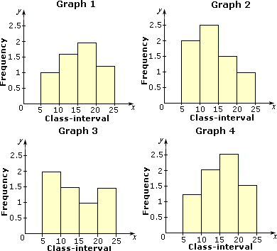
A. Figure 1
B. Figure 3
C. Figure 2
D. Figure 4
Step: 1
Take class-interval along the x y
Step: 2
Along y
Step: 3
Along x
Step: 4
Draw rectangles with bases 5 - 10, 10 - 15, 15 - 20 and 20 - 25 of heights 2, 2.5, 1.5 and 1 respectively.
Step: 5
The graph obtained is as follows.
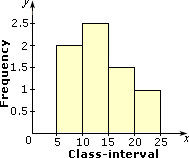
Step: 6
So, the histogram in Figure 2 represents the data given in the table correctly.
Correct Answer is : Figure 2
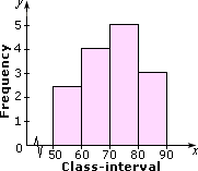
| Class-interval | Frequency |
| 50-60 | 2 |
| 60-70 | 3 |
| 70-80 | 5 |
| 80-90 | 5 |
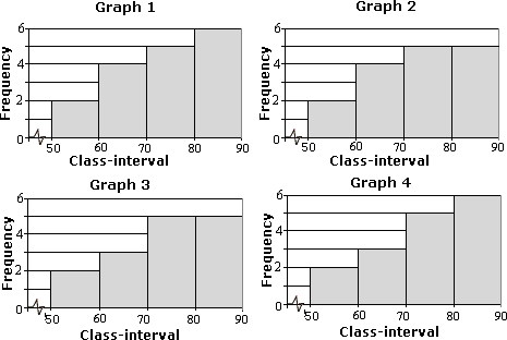
A. Graph 1
B. Graph 2
C. Graph 4
D. Graph 3
Step: 1
Take class-interval along the x y
Step: 2
Along y
Step: 3
Along x
Step: 4
Draw rectangles with bases 50 - 60, 60 - 70, 70 - 80 and 80 - 90 of heights 2, 3, 5 and 5 respectively.
Step: 5
Since the scale on x
Step: 6
The graph obtained is as follows.
Step: 7
Therefore, Graph 3 represents the data correctly.
Correct Answer is : Graph 3
| Hours | Temperature in Celsius |
| 50-60 | 2.5 |
| 60-70 | 4 |
| 70-80 | 5 |
| 80-90 | 3 |
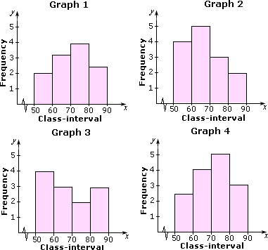
A. Graph 3
B. Graph 4
C. Graph 2
D. Graph 1
Step: 1
Take class-interval along the x y
Step: 2
Along y
Step: 3
Along x
Step: 4
Draw rectangles with bases 50 - 60, 60 - 70, 70 - 80 and 80 - 90 of heights 2.5, 4, 5 and 3 respectively.
Step: 5
Since the scale on x
Step: 6
The graph obtained is as follows.
Step: 7
So, the histogram in Graph 4 represents the data given in the table correctly.
Correct Answer is : Graph 4
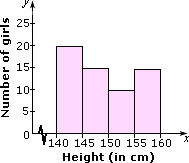
| Height (in cm) | Number of girls |
| 140-145 | 20 |
| 145-150 | 15 |
| 150-155 | 10 |
| 155-160 | 15 |
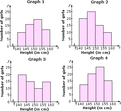
A. Figure 1
B. Figure 4
C. Figure 3
D. Figure 2
Step: 1
Take height of the girls along x y
Step: 2
Along y
Step: 3
Along x
Step: 4
Draw rectangles with bases 140-145, 145-150, 150-155 and 155-160 and heights 20, 15, 10 and 15 respectively.
Step: 5
Since the scale on x
Step: 6
The graph obtained is as follows.
Step: 7
Therefore, the histogram in Figure 3 represents the data correctly.
Correct Answer is : Figure 3
| Fuel efficiency (miles per gallon) | 10 - 15 | 15 - 20 | 20 - 25 | 25 - 30 | 30 - 35 | 35 - 40 | 40 - 45 |
| Number of cars | 2 | 16 | 28 | 20 | 8 | 4 | 2 |
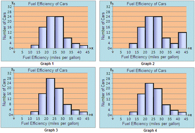
A. Graph 3
B. Graph 2
C. Graph 4
D. Graph 1
Step: 1
Take Fuel Effieciency (miles per gallon) along x y
Step: 2
Along x
Step: 3
Along y
Step: 4
Draw rectangles with bases 10 - 15, 15 - 20, 20 - 25, 25 - 30, 30 - 35, 35 - 40 and 40 - 45 of heights 2, 16, 28, 20, 8, 4 and 2 respectively.
Step: 5
The graph obtained is as follows:
Step: 6
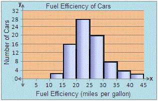
Step: 7
So, the histogram in Graph 3 represents the data given in the table accurately.
Correct Answer is : Graph 3
- Writing Quadratic Equations for Line of Fit-Algebra1-Solved Examples
- Constructing Line Plots-Algebra1-Solved Examples
- Constructing Box-and-Whisker Plots-Algebra1-Solved Examples
- Reading and Interpreting Scatter plots-Algebra1-Solved Examples
- Constructing Scatter Plots and Line of Fit-Algebra1-Solved Examples
- Comparing Two Related Sets of Data and Expected Value-Algebra1-Solved Examples
- Identifying Outliers-Algebra1-Solved Examples
- Comparing Linear, Quadratic and Exponential Models-Algebra1-Solved Examples
- Correlation Coefficient, Causation and Correlation-Algebra1-Solved Examples
- Meaning of Slope and Intercepts in Graphs and Situations-Algebra1-Solved Examples
Related Worksheet
- Data