Solved Examples and Worksheet for Constructing Scatter Plots and Line of Fit
| Peak | Elevation (in ft) |
| 1 | 6641 |
| 2 | 6660 |
| 3 | 6641 |
| 4 | 6680 |
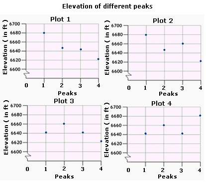
A. Plot 4
B. Plot 1
C. Plot 2
D. Plot 3
Step: 1
Start at the origin on a scatter plot.
Step: 2
Move 1 unit to the right on the horizontal axis.
[To represent Peak 1.]
Step: 3
Move 6,641 units up from the horizontal axis and plot a point.
[The height of the peak 1 is 6,641 ft]
Step: 4
From the origin move 2 units to the right on the horizontal axis.
[To represent Peak 2.]
Step: 5
Move 6,660 units up from the horizontal axis and plot a point.
[The height of Peak 2 is 6,660 ft.]
Step: 6
From the origin move 3 units to the right on the horizontal axis.
[To represent Peak 3.]
Step: 7
Move 6,641 units up from the horizontal axis and plot a point.
[The height of Peak 3 is 6,641 ft.]
Step: 8
From the origin move 4 units to the right on the horizontal axis.
[To represent the Peak 4.]
Step: 9
Move 6,680 units up from the horizontal axis and plot a point.
[The height of Peak 4 is 6,680 ft.]
Step: 10
Plot 4 is the scatter plot that represents the data given in the table.
Correct Answer is : Plot 4
| Grades | Boys | Girls |
| 8th | 80 | 25 |
| 9th | 60 | 30 |
| 10th | 40 | 35 |
| 11th | 30 | 45 |
| 12th | 20 | 65 |
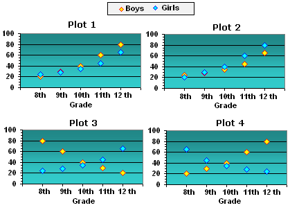
A. Plot 3
B. Plot 1
C. Plot 2
D. Plot 4
Step: 1
The height of each point represent the number of students of a particular gender in a particular grade.
Step: 2
The yellow colored points in the scatter plots represent the number of boys and the blue colored points represent the number of girls in each grade.
Step: 3
Observe the scatter plots for the heights of the points to match with the values in the table.
Step: 4
It can be observed that the scatter plot given in Plot 3 exactly matches the values given in the table.
Step: 5
So, Plot 3 is the appropriate scatter plot graph for the data.
Correct Answer is : Plot 3
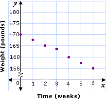
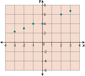
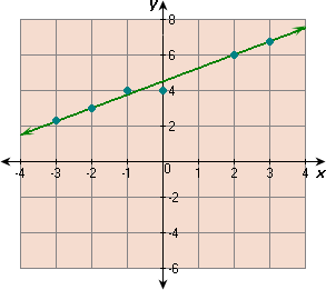
| 0 | 2 | 4 | 6 | 8 | 10 | |
| 42.29 | 39.83 | 37.37 | 34.91 | 32.45 | 29.99 |
A.
B.
C.
D.
Step: 1
Plot the points of the data and draw the line that best fits the points.
Step: 2
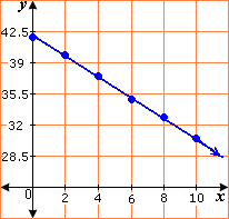
Step: 3
Two points on the line are (0, 42.29) and (6, 34.91).
Step: 4
[Slope of the line.]
Step: 5
[Slope-intercept form.]
Step: 6
[Replace m b
Step: 7
[Replace x
Step: 8
At x y
Correct Answer is : y x
A.
B.
C.
D.
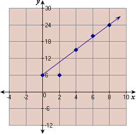
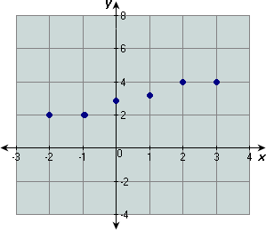
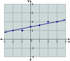
| 0 | 2 | 4 | 6 | 8 | |
| 6 | 6 | 15 | 20 | 24 |
A.
B. 9
C. 9
D. 9
Step: 1
Plot the points of the data and draw the line that best fits the points.
Step: 2
Step: 3
Two points on the line are (0, 6) and (8, 24).
Step: 4
[Slope of the line.]
Step: 5
[Slope-intercept form.]
Step: 6
Line cuts y y
Step: 7
[Replace m 9 4 b
Step: 8
So, the best fitting line for the given data is 9x y
Correct Answer is : 9x y
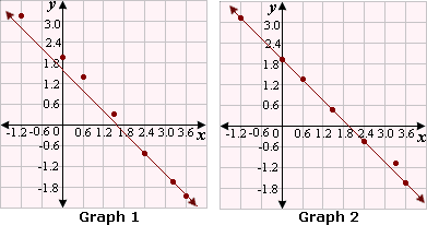
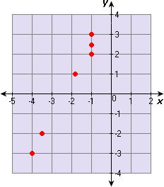
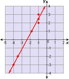
| 0 | 1 | 2 | 3 | 4 | 5 | 6 | |
| - 3 | 2 | - 1 | 0 | 2 | 3 | 2 |
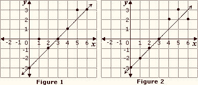
A. Figure 2,
B. Figure 1,
C. Figure 1,
D. Figure 2,
Step: 1
Plot the data as per the table.
Step: 2
Draw the line that best fit the points.
Step: 3

Step: 4
The two points that lie on the line are (3, 0) and (1, - 2).
Step: 5
[Find slope of the best-fitting line.]
Step: 6
[Substitute and simplify.]
Step: 7
Find the y
Step: 8
[Write slope-intercept form.]
Step: 9
0 = 1(3) + b
[Replace m x y
Step: 10
Step: 11
So, the equation of the best-fitting line is y x
[Use y m x b
Correct Answer is : Figure 2, y x
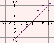
A.
B.
C.
D.
Step: 1
Draw the line that best fit the points.
Step: 2
Step: 3
Two points that lie on the line are (- 2, 3) and (2, 6).
Step: 4
[Find slope of the best-fitting line.]
Step: 5
[Substitute and simplify.]
Step: 6
Find the y
Step: 7
[Write slope-intercept form.]
Step: 8
3 = 3 4 b
[Replace m 3 4 x y
Step: 9
3 + 3 2 b
[Simplify.]
Step: 10
Step: 11
An equation of the best-fitting line is y 3 4 x 9 2
Correct Answer is : y 3 4 x 9 2
A. 2
B. 5
C. 2
D. 2
Step: 1
Draw the line that best fit the points.
Step: 2
Step: 3
Two points that lie on the line are (3, 4) and (- 2, 2).
Step: 4
[Find slope of the best-fitting line.]
Step: 5
[Substitute and simplify.]
Step: 6
Find the y
Step: 7
[Write slope-intercept form.]
Step: 8
4 = 2 5 b
[Replace m 2 5 x y
Step: 9
4 - 6 5 b
[Simplify.]
Step: 10
Step: 11
Step: 12
An equation of the best-fitting line is 2x y
Correct Answer is : 2x y
A. 11
B. 11
C. 11
D. 11
Step: 1
Draw the line that best fit the points.
Step: 2
Step: 3
Two points that lie on the line are (- 4, - 3) and (2, 8).
Step: 4
[Find slope of the best-fitting line.]
Step: 5
[Substitute and simplify.]
Step: 6
Find the y
Step: 7
[Write slope-intercept form.]
Step: 8
- 3 = 11 6 b
[Replace m 11 6 x y
Step: 9
- 3 + 22 3 b
[Simplify.]
Step: 10
Step: 11
Step: 12
An equation of the best-fitting line is 11x y
Correct Answer is : 11x y
| Countries | Percentage of male who smoke | Male Life Expectancy |
| USA | 28 | 72.4 |
| Denmark | 35 | 71.3 |
| France | 39 | 73.3 |
| Germany | 35.4 | 72.2 |
| Italy | 37 | 73.5 |
| Norway | 35.7 | 73.8 |
| Poland | 50 | 67.6 |
| Brazil | 38.4 | 56.4 |
| India | 38 | 57.2 |
| China | 60 | 65.8 |
| Iraq | 38 | 63.5 |
| Japan | 58 | 75.2 |
| Kuwait | 51 | 71.6 |
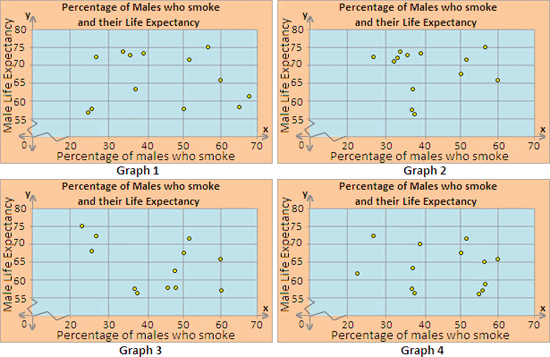
A. Graph 3
B. Graph 4
C. Graph 1
D. Graph 2
Step: 1
On a graph paper, represent the "Percentage of males who smoke" along x - axis and "Male Life Expectancy" along y - axis.
Step: 2
Plot the values on the graph, corresponding with those given in the table. The scatter plot should look like the one below.
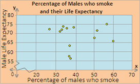
Step: 3
So, Graph 2 is the appropriate scatter plot for the data.
Correct Answer is : Graph 2
| Number of pages | Weight (in g) |
| 90 | 178 |
| 100 | 198 |
| 80 | 158 |
| 155 | 330 |
| 125 | 250 |
| 145 | 310 |
| 140 | 280 |
| 160 | 320 |
| 135 | 250 |
| 100 | 178 |
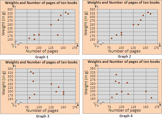
A. Graph 4
B. Graph 2
C. Graph 1
D. Graph 3
Step: 1
On a graph paper, represent the "Number of pages" along x y
Step: 2
Plot the values on the graph, corresponding with those given in the table. The scatter plot should look like the one below.
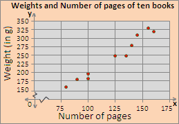
Step: 3
So, Graph 2 is the appropriate scatter plot for the data.
Correct Answer is : Graph 2
| Age (in years) | Annual Income (thousands of dollars) |
| 26 | 36 |
| 29 | 76 |
| 33 | 35 |
| 33 | 38 |
| 34 | 37 |
| 46 | 45 |
| 48 | 61 |
| 54 | 52 |
| 55 | 59 |
| 59 | 69 |
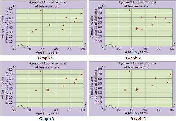
A. Graph 2
B. Graph 1
C. Graph 3
D. Graph 4
Step: 1
On a graph paper, represent the "Age (in years)" along x - axis and "Annual Income (thousands of dollars)" along y - axis.
Step: 2
Plot the values on the graph, corresponding with those given in the table. The scatter plot should look like the one below.
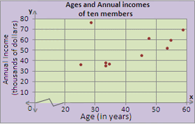
Step: 3
So, Graph 3 is the appropriate scatter plot for the data.
Correct Answer is : Graph 3
| Height (in cm) | Intelligent Quotient |
| 131 | 90 |
| 146 | 90 |
| 101 | 120 |
| 179 | 102 |
| 156 | 115 |
| 121 | 98 |
| 148 | 103 |
| 167 | 105 |
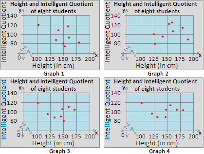
A. Graph 1
B. Graph 3
C. Graph 2
D. Graph 4
Step: 1
On a graph paper, represent the "Height (in cm)" along x - axis and "Intelligent Quotient" along y - axis.
Step: 2
Plot the values on the graph, corresponding with those given in the table. The scatter plot should look like the one below.
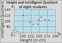
Step: 3
So, Graph 4 is the appropriate scatter plot for the data.
Correct Answer is : Graph 4
| Weight (in kg) | Waist size (in cm) |
| 86 | 100 |
| 64 | 70 |
| 51 | 61 |
| 93 | 112 |
| 86 | 87 |
| 78 | 86 |
| 58 | 70 |
| 63 | 82 |
| 44 | 57 |
| 76 | 84 |
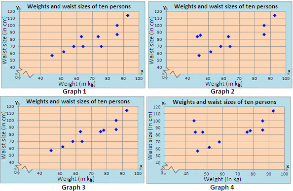
A. Graph 2
B. Graph 4
C. Graph 3
D. Graph 1
Step: 1
On a graph paper, represent the "Weight (in kg) along x y
Step: 2
Plot the values on the graph, corresponding with those given in the table. The scatter plot should look like the one below.
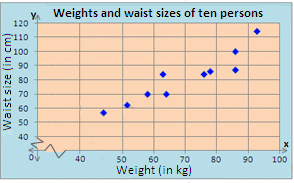
Step: 3
So, Graph 3 is the appropriate scatter plot for the data.
Correct Answer is : Graph 3
- Writing Quadratic Equations for Line of Fit-Algebra1-Solved Examples
- Constructing Line Plots-Algebra1-Solved Examples
- Constructing Histograms-Algebra1-Solved Examples
- Constructing Box-and-Whisker Plots-Algebra1-Solved Examples
- Reading and Interpreting Scatter plots-Algebra1-Solved Examples
- Comparing Two Related Sets of Data and Expected Value-Algebra1-Solved Examples
- Identifying Outliers-Algebra1-Solved Examples
- Comparing Linear, Quadratic and Exponential Models-Algebra1-Solved Examples
- Correlation Coefficient, Causation and Correlation-Algebra1-Solved Examples
- Meaning of Slope and Intercepts in Graphs and Situations-Algebra1-Solved Examples
Related Worksheet
- Data