Pie Chart
Definition Of Pie Chart
A Pie Chart is a circular chart which is divided into sectors in which the area of each sector represents the size of the data.
More About Pie Chart
It is also known as circle graph.
Pie charts are used to show data in proportion.
When all the sectors are combined together it forms a complete disk.
Examples of Pie Chart
Video Examples: Drawing Pie Charts
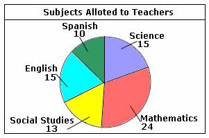
The pie chart shown above represents the number of teachers for different subjects in a school.
The number at each pie slice indicates the number of teachers allotted for the particular subject.
As the pie chart shows, the number of teachers allotted for Mathematics is 24; the number of teachers allotted for Social Studies is 13; the number of teachers allotted for English is 15; the number of teachers allotted for Spanish is 10; and the number of teachers allotted for Science is 15.
Solved Example on Pie Chart
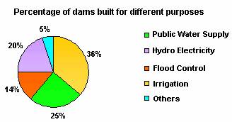
Ques: The pie chart shown below represents the percentage of dams built for different purposes. Find the total percentage of dams built for irrigation and hydroelectricity generation.
Choices:
A. 56%
B. 38%
C. 40%
D. 45%
Correct Answer: A
Solution:
Step 1: From the pie chart, the percentage of dams built for irrigation = 36
Step 2: Percentage of dams built for generating hydroelectricity = 20
Step 3: Percentage of dams built for irrigation and for generating hydroelectricity = 36 + 20 = 56 [Add the percentages.]
Step 4: So, 56% of the dams were built for irrigation and for generating hydroelectricity.