Solved Examples and Worksheet for Scatter Plots Line of Best Fit and its Correlations
A. Data is insufficient to decide the kind of trend
B. Negative trend
C. Positive trend
D. No trend
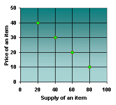
Step: 1
From the graph, as the supply of an item increases, the price of the item decreases and as the supply decreases, the price of the item increases.
Step: 2
If one set of data values tends to decrease with an increase in the other set of data, the plot is said to follow a negative trend.
Step: 3
So, the scatter plot shows a negative trend.
[Price decreases as supply increases.]
Correct Answer is : Negative trend
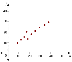
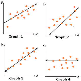
A. Strong negative linear correlation
B. Weak positive linear correlation
C. Weak negative correlation
D. Strong positive linear correlation
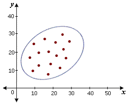
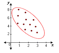
Step: 1
Since the oval formed is narrow and it tilts like a line as shown with positive slope, the given correlation is a strong positive linear correlation.
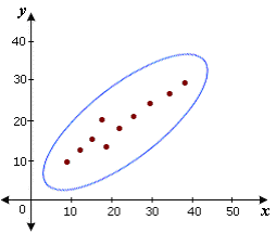
[Draw a oval around the points of the given scatter plot.]
Correct Answer is : Strong positive linear correlation
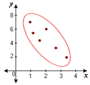
A. Weak negative linear correlation
B. Strong positive linear correlation
C. Weak positive linear correlation
D. Strong positive linear correlation
Step: 1
Since the oval formed is bulgier and it tilts like a line with positive slope, the given linear correlation is a weak positive linear correlation.
[Draw a oval around the points of the given scatter plot.]
Correct Answer is : Weak positive linear correlation
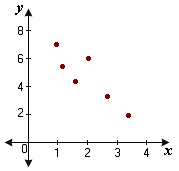
A. Weak negative linear correlation
B. Strong negative linear correlation
C. Strong positive linear correlation
D. Weak positive linear correlation
Step: 1
Since the oval formed is narrow and it tilts like a line with negative slope, it represents a strong negative linear correlation.
[Draw a oval around the points of the given scatter plot.]
Correct Answer is : Strong negative linear correlation
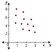
A. Strong positive linear correlation
B. Strong negative linear correlation
C. Weak negative linear correlation
D. Weak positive linear correlation
Step: 1
Since, the oval formed is bulgier and it tilts like a line with negative slope, the given correlation represents a weak negative linear correlation.
[Draw a oval around the points of the given scatter plot.]
Correct Answer is : Weak negative linear correlation
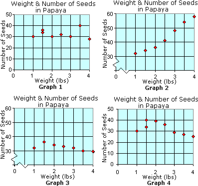
A. Graph 1
B. Graph 4
C. Graph 3
D. Graph 1 and Graph 2
E. Graph 2
Step: 1
There exists a positive relationship between the weight and seeds in papaya if the weight increases with the number of seeds.
Step: 2
Only Graph 2 shows this relation. So, Graph 2 is the correct answer.
Correct Answer is : Graph 2
A. Graph 4
B. Graph 1
C. Graph 2
D. Graph 3
Step: 1
A straight line that best represents the data on a scatter plot is referred to as the line of best fit.
Step: 2
Among the graphs shown, Graph 1 best represents the data on the scatter plot.
Correct Answer is : Graph 1
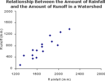
A. about 1200 mm
B. about 900 mm
C. about 1500 mm
D. about 170 mm
Step: 1
Draw a trend line that closely fits the data points on the scatter plot as shown.
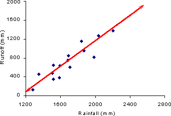
Step: 2
To find the amount of runoff if there is a rainfall of 2000 mm, draw a line to meet the trend line as shown.
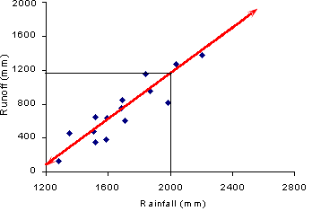
Step: 3
So, the amount of runoff if there is a rainfall of 2000 mm is about 1200 mm.
Correct Answer is : about 1200 mm
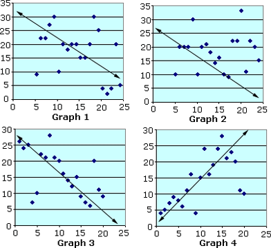
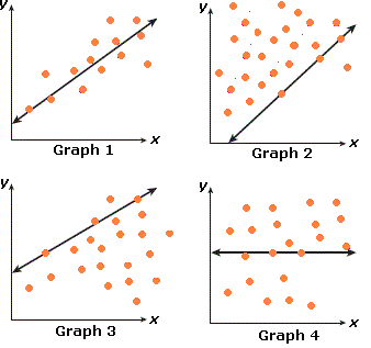
A. Graph 3
B. Graph 1
C. Graph 4
D. Graph 2
Step: 1
From the graphs, it can be easily observed that the line in Graph 4 shows the trend of the data set with positive slope.
Step: 2
So, the line in Graph 4 shows the positive correlation of the data shown.
Correct Answer is : Graph 4
A. Graph 3
B. Graph 2
C. Graph 4
D. Graph 1
Step: 1
Count the number of data points that lies on the line in all these graphs.
Step: 2
Among the graphs, maximum number of data points are lying on the line in Graph 3.
Step: 3
So, Graph 3 best represents the line that best fits the data points.
Correct Answer is : Graph 3
- Finding Intercepts of Linear Relations-Gr 8-Solved Examples
- Slope of a Line from its Graph-Gr 8-Solved Examples
- Constructing Scatter Plots-Gr 8-Solved Examples
- Interpreting Scatter Plots-Gr 8-Solved Examples
Related Worksheet
- Data