Solved Examples and Worksheet for Constructing Scatter Plots
| Time (in minutes) | Depth (in cm) |
| 2 | 6 |
| 4 | 7 |
| 6 | 18 |
| 8 | 19 |
| 10 | 20 |
| 12 | 24 |
| 14 | 32 |
| 16 | 37 |
| 18 | 38 |
| 20 | 41 |
| 22 | 47 |
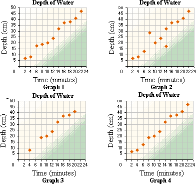
A. Graph 1
B. Graph 4
C. Graph 3
D. Graph 2
Step: 1
On a graph paper, represent the time in minutes along the x y
Step: 2
Plot the values on the graph, corresponding with those given in the table. The scatter plot should look like the one below.
Step: 3
Graph 1 matches the given data.
Correct Answer is : Graph 1
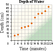
| Time (in minutes) | Depth (in cm) |
| 2 | 6 |
| 4 | 7 |
| 6 | 18 |
| 8 | 29 |
| 10 | 20 |
| 12 | 24 |
| 14 | 18 |
| 16 | 37 |
| 18 | 38 |
| 20 | 41 |
| 22 | 47 |
A. Graph 4
B. Graph 2
C. Graph 3
D. Graph 1
Step: 1
In a graph paper, represent the time in minutes along the x y
Step: 2
Plot the values in the table. The scatter plot would look like the one below.
Step: 3
Graph 2 matches the given data.
Correct Answer is : Graph 2
| Peak | Elevation (in ft) |
| 1 | 6641 |
| 2 | 6660 |
| 3 | 6641 |
| 4 | 6680 |
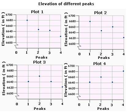
A. Plot 4
B. Plot 1
C. Plot 2
D. Plot 3
Step: 1
Start at the origin on a scatter plot.
Step: 2
Move 1 unit to the right on the horizontal axis.
[To represent Peak 1.]
Step: 3
Move 6,641 units up from the horizontal axis and plot a point.
[The height of the peak 1 is 6,641 ft]
Step: 4
From the origin move 2 units to the right on the horizontal axis.
[To represent Peak 2.]
Step: 5
Move 6,660 units up from the horizontal axis and plot a point.
[The height of Peak 2 is 6,660 ft.]
Step: 6
From the origin move 3 units to the right on the horizontal axis.
[To represent Peak 3.]
Step: 7
Move 6,641 units up from the horizontal axis and plot a point.
[The height of Peak 3 is 6,641 ft.]
Step: 8
From the origin move 4 units to the right on the horizontal axis.
[To represent the Peak 4.]
Step: 9
Move 6,680 units up from the horizontal axis and plot a point.
[The height of Peak 4 is 6,680 ft.]
Step: 10
Plot 4 is the scatter plot that represents the data given in the table.
Correct Answer is : Plot 4
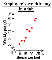
| Hours worked ( | Weekly pay ( |
| 10 | 50 |
| 12 | 55 |
| 14 | 55 |
| 15 | 60 |
| 16 | 73 |
| 18 | 70 |
| 20 | 75 |
| 22 | 87 |
| 23 | 90 |
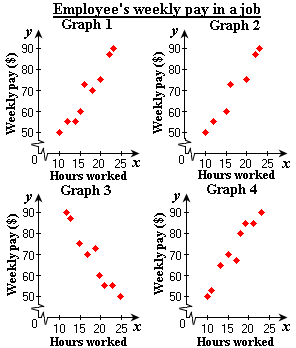
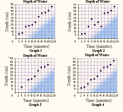
A. Graph 3, negative relationship
B. Graph 4, positive relationship
C. Graph 2, positive relationship
D. Graph 1, positive relationship
Step: 1
Construct a scatter plot for the data.
Step: 2
From the scatter diagram, we can say that as the hours worked increases the weekly pay also increases.
Step: 3
So, the relationship is a positive relationship.
Step: 4
Therefore, Graph 1 is the correct answer since it matches the graph plotted.
Correct Answer is : Graph 1, positive relationship
| Number of rooms ( | Percentage of number of houses ( |
| 1 | 2.2 |
| 2 | 4.8 |
| 3 | 9.7 |
| 4 | 16.0 |
| 5 | 20.9 |
| 6 | 18.5 |
| 7 | 12.1 |
| 8 | 8.1 |
| 9 | 7.7 |
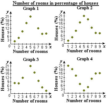
A. Graph 1, no relationship
B. Graph 3, no relationship
C. Graph 2, no relationship
D. Graph 4, no relationship
Step: 1
Plot the scatter diagram for the data.
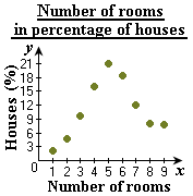
Step: 2
From the scatter diagram, we can say that the graph does not follow any trend.
Step: 3
So, there is no relationship.
Step: 4
Therefore, Graph 2 is the correct answer since it matches the graph plotted.
Correct Answer is : Graph 2, no relationship
| Car Type | Weight (pounds) | miles per gallon |
| A | 2750 | 29 |
| B | 3125 | 23 |
| C | 2100 | 33 |
| D | 4082 | 18 |
| E | 2690 | 20 |
| F | 3640 | 21 |
| G | 4380 | 14 |
| H | 2241 | 25 |
| I | 2895 | 31 |
| J | 3659 | 17 |
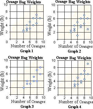
Pick the appropriate scatter plot for the data.
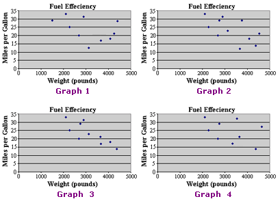
A. Graph 2
B. Graph 2 and Graph 3
C. Graph 3
D. Graph 4
E. Graph 1
Step: 1
The values in the table match with Graph 3.
Correct Answer is : Graph 3
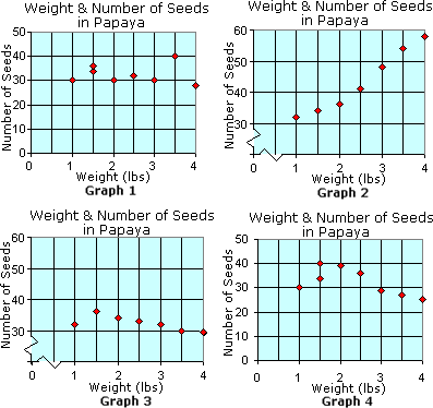
A. Graph 1
B. Graph 4
C. Graph 3
D. Graph 1 and Graph 2
E. Graph 2
Step: 1
There exists a positive relationship between the weight and seeds in papaya if the weight increases with the number of seeds.
Step: 2
Only Graph 2 shows this relation. So, Graph 2 is the correct answer.
Correct Answer is : Graph 2
| Grades | Boys | Girls |
| 8th | 80 | 25 |
| 9th | 60 | 30 |
| 10th | 40 | 35 |
| 11th | 30 | 45 |
| 12th | 20 | 65 |
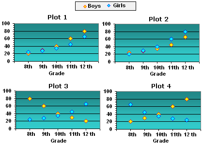
A. Plot 3
B. Plot 1
C. Plot 2
D. Plot 4
Step: 1
The height of each point represent the number of students of a particular gender in a particular grade.
Step: 2
The yellow colored points in the scatter plots represent the number of boys and the blue colored points represent the number of girls in each grade.
Step: 3
Observe the scatter plots for the heights of the points to match with the values in the table.
Step: 4
It can be observed that the scatter plot given in Plot 3 exactly matches the values given in the table.
Step: 5
So, Plot 3 is the appropriate scatter plot graph for the data.
Correct Answer is : Plot 3
| Age (in years) | Weight (in pounds) |
| 2 | 20 |
| 3 | 20 |
| 4 | 28 |
| 5 | 35 |
| 6 | 35 |
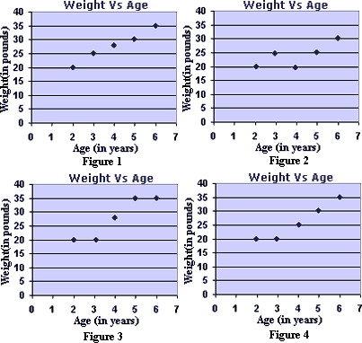
A. Figure 1
B. Figure 4
C. Figure 3
D. Figure 2
Step: 1
In the scatter plots, the age of the child is taken along the x-axis and his weight is taken along y-axis.
Step: 2
Each point indicates the weight of the child at the particular age.
Step: 3
Observe the graphs to match the heights of the points with the values given in the table.
Step: 4
It is observed that the points in Figure 3 exactly match the values in the table.
Step: 5
So, Figure 3 is the appropriate representation of the values in the table.
Correct Answer is : Figure 3
- Finding Intercepts of Linear Relations-Gr 8-Solved Examples
- Slope of a Line from its Graph-Gr 8-Solved Examples
- Interpreting Scatter Plots-Gr 8-Solved Examples
- Scatter Plots Line of Best Fit and its Correlations-Gr 8-Solved Examples
Related Worksheet
- Data