Solved Examples and Worksheet for Interpreting Scatter Plots
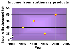
A. $45,000
B. $40,000
C. $50,000
D. $35,000
Step: 1
The height of each point in the graph indicates the income (in $1000) of the dealer in the particular year.
Step: 2
From the graph, the incomes of the dealer in 1985, 1990, 1995 and 2000 are $40000, $45000, $35000, and $50000.
Step: 3
The income of the dealer in 1990 was $45000.
Correct Answer is : $45,000
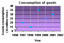
A. 10 million tons
B. 35 million tons
C. 25 million tons
D. 30 million tons
Step: 1
From the plot the consumption of the goods in 1999 was 35 million tons.
Step: 2
The consumption of the goods in the year 2000 was 25 million tons.
Step: 3
So, the decrease in the consumption of goods is 35 - 25 = 10 million tons.
Correct Answer is : 10 million tons
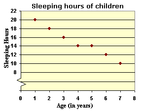
A. 4
B. 3
C. 7
D. 5
Step: 1
The height of each point in the scatter plot indicates the number of hours a child of the particular age sleeps for.
Step: 2
From the graph, the number of hours a 4 year old child sleeps is 14.
[The vertical coordinate of the point corresponding to 4 years is 14.]
Step: 3
From the graph, the number of hours a 7 year old child sleeps is 10.
[The vertical coordinate of the point corresponding to 7 years is 10.]
Step: 4
The difference between the number of sleeping hours of a 4 year old and 7 year old child = 14 - 10 = 4 hours.
[Subtract 10 from 14.]
Step: 5
So, a 4 year old child sleeps for 4 more hours than a 7 year old child.
Correct Answer is : 4
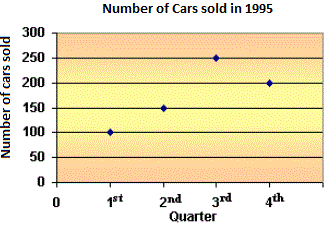
A. 1st - 2nd
B. 2nd - 3rd
C. 3rd - 4th
D. The sales never declined
Step: 1
The number of cars sold in different quarters of the year 1995 is shown on the given scatter plot.
Step: 2
The number of cars sold in the 1st quarter of the year 1995 = 100.
Step: 3
The number of cars sold in the 2nd quarter of the year 1995 = 150.
Step: 4
The number of cars sold in the 3rd quarter of the year 1995 = 250.
Step: 5
The number of cars sold in the 4th quarter of the year 1995 = 200.
Step: 6
By looking at the above data, we notice that, the number of cars sold is increased from 1st quarter to 3rd quarter, and decreased from 3rd quarter to 4th quarter.
Step: 7
Therefore, in between 3rd and 4th quarters the number of cars sold is declined.
Correct Answer is : 3rd - 4th
A. 75 mph
B. 50 mph
C. 100 mph
D. 80 mph
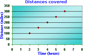
Step: 1
Each point on the scatter plot represents the distance in miles traveled by Paula by the particular time.
Step: 2
Speed = Distance time
[Speed is defined as the rate of distance traveled.]
Step: 3
So, the speed at which Paula drives = 150 3
[Divide the vertical coordinate of any point by the corresponding horizontal coordinate.]
Step: 4
So, Paula is driving at 50 mph speed from St. Paul to Providence.
Correct Answer is : 50 mph
A. 75 mph
B. 50 mph
C. 80 mph
D. 100 mph
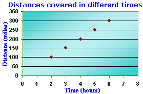
Step: 1
Each point on the scatter plot represents the distance in miles traveled by Valerie by the particular time.
Step: 2
Speed = Distance time
[Speed is defined as the rate of distance traveled.]
Step: 3
So, the speed at which Valerie drives = 100 2
[Divide the vertical coordinate of any point by the corresponding horizontal coordinate.]
Step: 4
So, Valerie is driving at 50 mph speed from Milan to Rosedale.
Correct Answer is : 50 mph
A. $40
B. $10
C. $30
D. $20
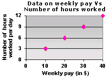
Step: 1
The height of each point in the plot represents the number of hours worked corresponding to the weekly pay.
Step: 2
The weekly pay is $10 when the number of hours worked per week is 3.
[The corresponding value of the weekly pay is $10 when the height of the point represents the value 3.]
Step: 3
The weekly pay is $30 when the number of hours worked per week is 9.
[The corresponding value of the weekly pay is $30 when the height of the point represents the value 9.]
Step: 4
Increase in the weekly pay with the increase in the number of hours worked from 3 to 9 = Weekly pay when the number of hours worked is 9 - Weekly pay when the number of hours worked is 3
= $30 - $10 = $20
[Substitute and subtract.]
Step: 5
So, the increase in the weekly pay as the number of hours worked increases from 3 to 9 is $20.
Correct Answer is : $20
A. 20 sec
B. 40 sec
C. 30 sec
D. 10 sec
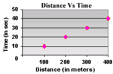
Step: 1
The height of each point in the plot represents the time taken to cover the corresponding distance.
Step: 2
From the plot, the total distance recorded is 400 m.
[The final point represents a distance of 400 m.]
Step: 3
The vertical coordinate corresponding to the distance of 400 m covered is 40.
Step: 4
So, the time taken to cover the total distance is 40 sec.
Correct Answer is : 40 sec
A. $1,000
B. $3,000
C. $2,000
D. $4000
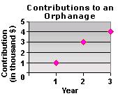
Step: 1
The height of each point in the plot represents the contribution made in that particular year.
Step: 2
The height of the point corresponding to the 1st year represents the value $1000, which is the least.
Step: 3
So, the minimum contribution made to the orphanage was $1,000.
Correct Answer is : $1,000

A. 100 lb
B. 50 lb
C. 175 lb
D. 125 lb
Step: 1
In the scatter plot, the horizontal axis represents Dennis's age and the vertical axis represents his weight in lb.
Step: 2
The vertical distance of each point in the scatter plot indicates the weight of Dennis as he grew old.
Step: 3
From the graph, the vertical distance of the point corresponding to 20 is 100.
Step: 4
So, Dennis weighed 100 lb when he was 20 years old.
Correct Answer is : 100 lb
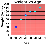
A. 10 years
B. 20 years
C. 60 years
D. 30 years
Step: 1
In the scatter plot, the horizontal axis represents Frank's age and the vertical axis represents his weight in lb.
Step: 2
The vertical distance of each point in the scatter plot indicates the weight of Frank as he grew older.
Step: 3
From the graph, the vertical distance of the point corresponding to age 60 is 175.
Step: 4
So, Frank's weight was 175 lb when he was 60 years old.
Correct Answer is : 60 years

A. 1985
B. 2000
C. 1990
D. 1995
Step: 1
The height of each point in the graph indicates the income (in $1000) of the dealer in the particular year.
Step: 2
From the graph, the incomes of the dealer in 1985, 1990, 1995 and 2000 are $40000, $45000, $35000 and $50000 respectively.
Step: 3
The income of the dealer in the year 1995 was the least.
Correct Answer is : 1995
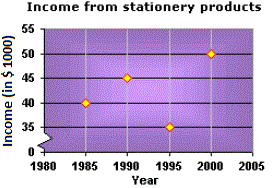
A. $45,000
B. $40,000
C. $50,000
D. $35,000
Step: 1
In the scatter plot, the horizontal axis indicates the year and the vertical axis indicates the income (in $1000) earned by the wholesale dealer.
Step: 2
The height of each point in the graph indicates the income (in $1000) of the dealer in the particular year.
Step: 3
From the graph, the vertical coordinate of the point corresponding to the year 2000 is 50.
Step: 4
So, the income of the wholesale dealer in 2000 was $50,000.
Correct Answer is : $50,000
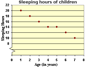
A. 7
B. 5
C. 8
D. 6
Step: 1
The height of each point in the scatter plot indicates the number of hours a child of the particular age sleeps for.
Step: 2
From the graph, the number of hours a 2 year old child sleeps is 18.
[The vertical coordinate of the point corresponding to 2 years is 18.]
Step: 3
From the graph, the number of hours a 6 year old child sleeps is 12.
[The vertical coordinate of the point corresponding to 6 years is 12.]
Step: 4
The difference between the number of sleeping hours of a 2 year old and 6 year old child = 18 - 12 = 6 hours
[Subtract 12 from 18.]
Step: 5
So, a 2 year old child sleeps for 6 more hours than a 6 year old child.
Correct Answer is : 6
A. 80
B. 83
C. 85
D. 81
Step: 1
Draw a vertical line starting from 20 hours in the scatter plot. This line intersects the trend line at a point.
Step: 2
From the intersection, draw a horizontal line that intersects the y y y
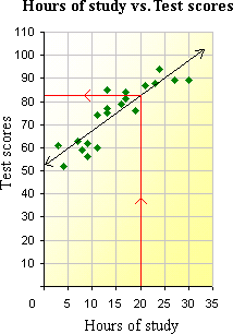
Step: 3
So, a student who studied for 20 hours would have scored about 83 points.
Correct Answer is : 83
- Collecting Data-Formulating a Question-Gr 6-Solved Examples
- Measures of Central Tendency-Gr 6-Solved Examples
- Measures of Central Tendency-Gr 6-Solved Examples
- Appropriate Measures of Central Tendency for the Data-Gr 6-Solved Examples
- Range-Gr 6-Solved Examples
- Interpreting Histograms-Gr 6-Solved Examples
- Interpreting Line Plots-Gr 6-Solved Examples
- Interpreting Box Plots and Finding Interquartile Range-Gr 6-Solved Examples
Related Worksheet
- Data
Related Topic