SLIDING BAR GRAPH
Definition Of Sliding Bar Graph
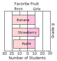
Sliding bar graphs show two categories as bars graphed in opposite directions. They can be used to compare amounts or frequencies.
Example of Sliding Bar Graph
The sliding bar graph shown below represents the favorite fruit of grade 8 for both boys and girls.
Video Examples: Parallel and Sliding Bar Graph
Solved Example on Sliding Bar Graph
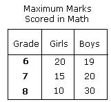
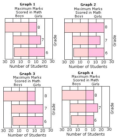
Ques: The table shows the maximum marks scored by the Grade 6, 7, and 8 students in math. Which of the following is the correct sliding bar graph for the table shown?
Choices:
A. Graph 1
B. Graph 2
C. Graph 3
D. Graph 4
Correct Answer: A
Solution:
Step 1: The values in the Graph 1 matches with the values in the table.
Step 2: So, Graph 1 is the correct sliding bar graph representing the data in the given table.
Quick Summary
- Sliding bar graphs are used to compare two sets of data.
- Bars extend in opposite directions from a central axis.
- Visual representation of differences between categories.
🍎 Teacher Insights
Encourage students to create their own sliding bar graphs from real-world data. Discuss the advantages and disadvantages of this type of graph compared to other types.🎓 Prerequisites
- Basic understanding of bar graphs
- Knowledge of data representation
- Ability to compare numerical values
Check Your Knowledge
Q1: Which of the following is best represented by a sliding bar graph?
Frequently Asked Questions
Q: When should I use a sliding bar graph?
A: Use it when you want to compare two related sets of data and highlight the differences between them.
Q: How do I read a sliding bar graph?
A: Read the length of each bar to determine the quantity for each category. Pay attention to the labels and the central axis.