LINE GRAPH
Definition Of Line Graph
Line graph is a graph that uses line segments to connect data points and shows changes in data over time.
More About Line Graph
Multiple Line Graph: Multiple line graph is a line graph that shows changes in data over time for more than one category.
Video Examples: Learning About Line Graphs
Example of Line Graph
The line graph shows the annual income of a person over a period of 7 years

Solved Example on Line Graph
Ques: Irena recorded her test scores in a line graph as shown. What is Irena's score on the Math test?
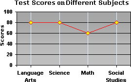
Choices:
A. 50
B. 80
C. 60
D. 40
Correct Answer: C
Solution:
Step 1: The height of each point in the line graph represents Irena's score on the particular test.
Step 2: Note the height of the point representing Irena's score on the Math test.
Step 3: The height of the point is 60.
Step 4: So, Irena scored 60 on the Math test.
Quick Summary
- Line graphs show trends over time.
- Data points are connected by lines.
- Multiple line graphs can show multiple categories.
🍎 Teacher Insights
Encourage students to create their own line graphs using real-world data, such as temperature changes or plant growth. Emphasize the importance of clear labeling and accurate plotting of data points.🎓 Prerequisites
- Basic counting skills
- Understanding of coordinate plane
- Ability to read data from tables
Check Your Knowledge
Q1: What type of graph is best for showing changes in data over time?
Q2: In a line graph showing annual income, what does the x-axis typically represent?
Frequently Asked Questions
Q: What is the purpose of a line graph?
A: To show how data changes over a period of time.
Q: What are the axes on a line graph?
A: The horizontal axis (x-axis) usually represents time, and the vertical axis (y-axis) represents the quantity being measured.